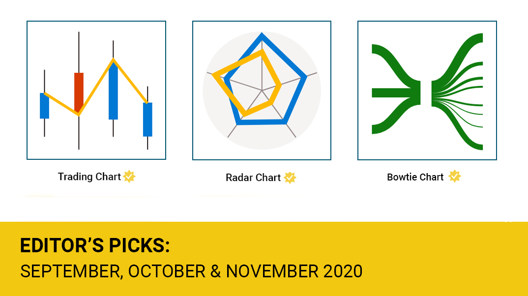
In September 2020, MAQ Software was honored to be included in the official Microsoft Power BI team’s first ever "Editor's picks." Selected as premiere visual of the month, Trading Chart by MAQ Software breaks down historical trading records into a simple, color-coded chart. Trading Chart enables business leaders to quickly identify when stock prices are dropping or rising based on customizable price and time ranges. Trading Chart has been downloaded over 18,000 times on AppSource.
One month later, Radar Chart by MAQ Software was selected for the October 2020 Editor's picks. Radar Chart breaks variables down into a series of spokes and connector lines, creating a colorful, star-like visual. Business leaders can use Radar Chart to compare data points across multiple variables. For example, a finance manager can compare the performance of multiple companies across sales and profit variables. Radar Chart has over 13,000 downloads and is rated 4.7 out of 5 on AppSource.
The November 2020 Editor’s picks highlight Bowtie Chart by MAQ Software. Bowtie Chart displays how data flows between categories. Useful for comparing values across categories and subcategories, Bowtie Chart is ideal for assessing risk management and sales procedures. Sales executives can highlight the multiple sales avenues and their contribution to overall revenue. Bowtie Chart by MAQ Software has 22,000 downloads on AppSource.
Using visuals to represent complex data relationships enables business leaders to quickly spot performance gaps and act on opportunity.
Download free visuals from Microsoft AppSource now:
Trading Chart on AppSource
Radar Chart on AppSource
Bowtie Chart on AppSource
Using visuals to represent complex data relationships enables business leaders to quickly spot performance gaps and act on opportunity.
Download free visuals from Microsoft AppSource now:
Trading Chart on AppSource
Radar Chart on AppSource